Primary Green
PANTONE 2273 C
HEX #207028
RGB 32 / 112 / 40
CMYK 85.33 / 31.35 / 100 / 21.48
01 / Brand Challenge
The dermatology and skincare market is filled with brands that look very similar. Most rely on clinical aesthetics and minimal visual systems to communicate trust.
The challenge was to create a brand that feels professional and credible while establishing a distinct and memorable identity.
02 / Moodboard Direction
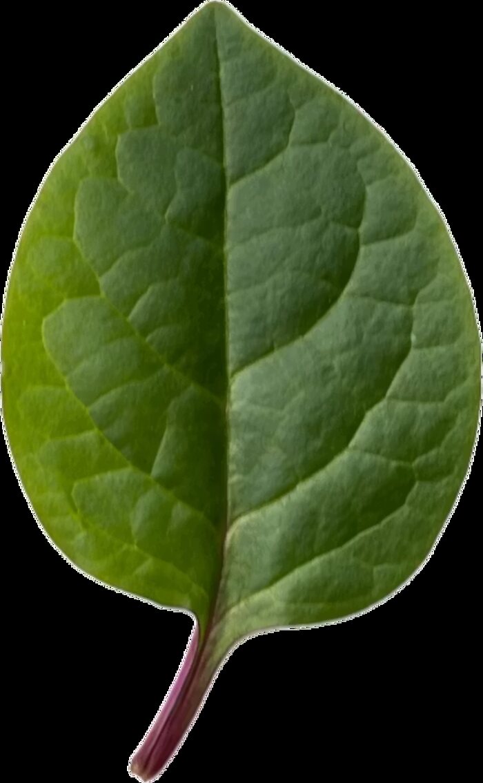
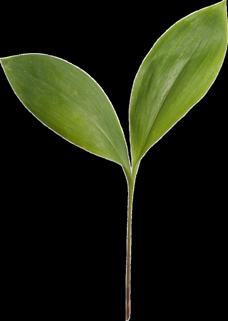
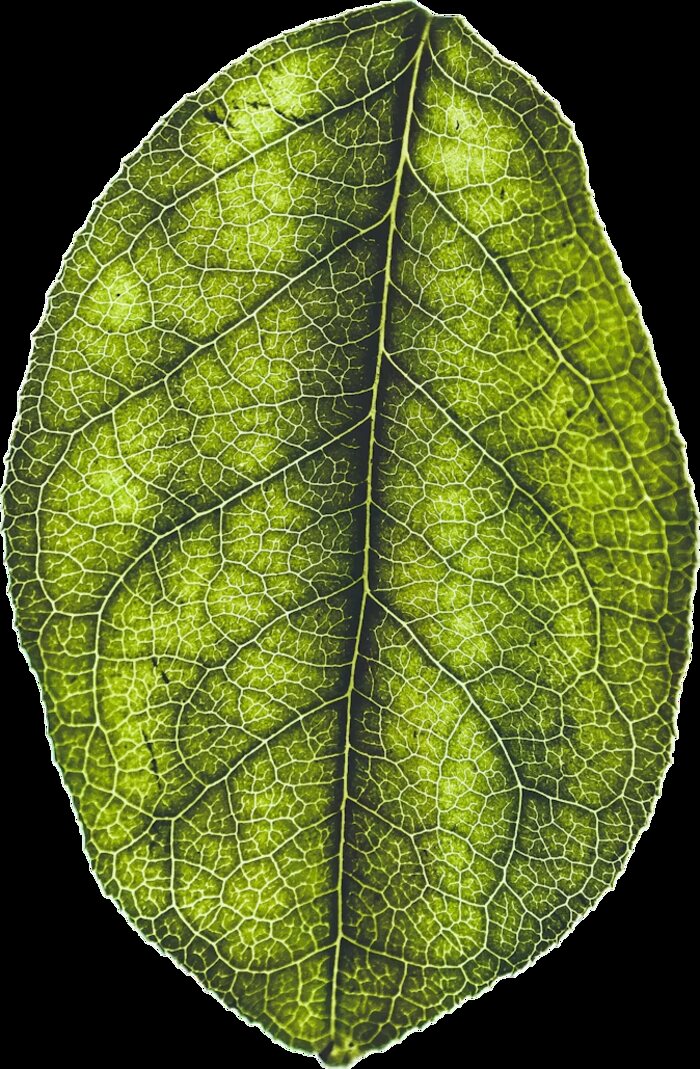
During the research phase, I explored visual elements that reflect the feelings often associated with dermatology and skincare products, such as calmness, freshness, care, and well-being. The leaf stood out as a simple and timeless symbol that naturally represents these qualities.
03 / Logo Concept
While designing the logo, I drew inspiration from the sense of clarity, calmness, and freshness that a leaf naturally evokes. Believing these qualities closely align with the world of dermatology, I developed the Dermoworld logo from the form of a real leaf.
The symbol is intended to reflect the brand’s trustworthy and thoughtful approach to skin health.
04 / Visual Identity
Primary Green
PANTONE 2273 C
HEX #207028
RGB 32 / 112 / 40
CMYK 85.33 / 31.35 / 100 / 21.48
Fresh Green
PANTONE 2287 C
HEX #52C300
RGB 82 / 195 / 0
CMYK 66.98 / 0 / 100 / 0
Brand Typeface
Futura PT
Demi
Dermoworld
The World of Dermatology
05 / Logo Outputs